 |

Set Review: 7117 Gresh
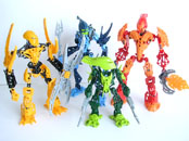
I suppose as good a way as any to start this is to remark upon how it�s a little bit odd to see Gresh and Skrall among this last wave of Bionicle sets. For being marketed as the �Stars� of the line, the best of the best of nine years of sets, rather few of them live up to that description. Tahu and Takanuva alone are truly longtime stars of Bionicle, followed up by a generic Rahkshi for what I think can be said with little dispute were among the best villain sets ever. By contrast, Gresh and Skrall have only been out for a single year. And though both of their Star forms are adorable and well-made little sets, I can�t help but think there were many much more deserving candidates to be brought back. Lewa Nuva leaps to mind instead of Gresh, really. But we�re stuck with Gresh, and he is a very nice set. If I had to pick a single set to represent 2009, it would probably be him, actually, as he was among the most innovative and best-designed sets we saw last year. But I just don�t see why 2009 needs to be brought back when, well, it�s still here as far as story goes. Especially at the expense of other years. Sigh. Presentation
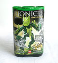
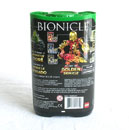
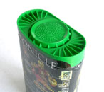
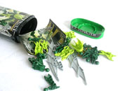
I have absolutely no objections to finally losing the Avotoran packaging. I quite like the Stars� canister design; it�s simple but elegant, but as it�s taller than the Avotoran boxthings I would have liked to see the Stars� pieces take up more than just half of its volume. Maybe if the Stars were some sort of unique intermediary between the Matoran and Toa size, rather than just Avotoran builds with a few extra pieces. Gresh�s canister artwork is actually really unflattering. The head-on view makes his mask look squashed and unappealing, quite unlike the real thing, and his pose doesn�t do a good job of showing off the elegance of his blades. He looks much much better in person. But, I do quite like the fact that the background is a golden Kanohi Hau. There are few more direct ways to recall 2001, though the image itself is a little dark because of it� Maybe if there were light coming through the mask�s holes? The back has all the usual material �� legalese, Gresh stuffed into his canister � and the diagram of Tahu in his golden armor. One thing I do have to wonder extraordinarily at is why in Mata Nui�s name his canister lid is medium green. It looks very nice, but I can�t find any reason for them to have changed the green canister lid from lime to medium green � it�s one thing for the Piraka�s lid to be medium blue, since all the blue canisters have had that color since 2008, but for green, they�ve all been lime since then. So why we suddenly went from lime (which actually is one of Gresh�s colors) to this in the last green Bionicle canister ever simply defies explanation. It also brings Lewa to mind again. Since, you know, he actually is medium green like that. Really? Building
If you have so much as the slightest familiarity with the Avotoran design, you could build Gresh with your eyes closed. I�m not kidding. Set Design
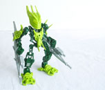
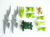
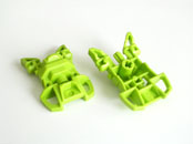
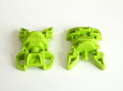
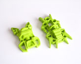
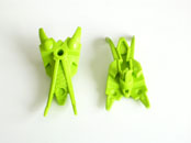
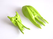
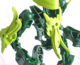
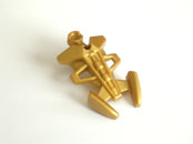
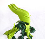
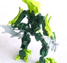
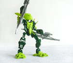
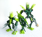
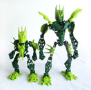
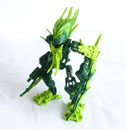
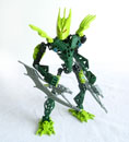
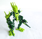
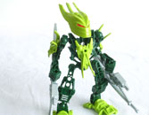
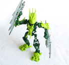
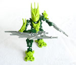
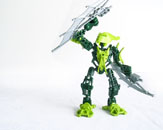
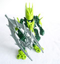
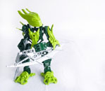
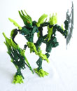
Going off of what I said before, for being Avotoran with a few extra pieces, the Stars do an awfully good job at not being Matoran. This comes very simply from the fact that the Stars have layers in their design, a virtue of the new armor pieces they have. They aren�t very deep layers, but they�re there, and they�re enough. Their size has led me to think of the Stars as tributes to the original sets, rather than true remakes. Since they function very well as tributes � smaller, simpler versions of characters and species we know well � and if one looks at them that way, they�re very enjoyable little sets. Gresh himself is an adorable little guy, and his color scheme is just about perfect � thanks to his new armor piece, the lime and dark green are perfectly balanced, and there are no extraneous colors lying around to mess it up. Even the silver blades look good on him. I had thought they would be just too much silver, from the CGI, but they actually work nicely with the rest. And of course, he comes with a hefty haul of new pieces. Ten of his nineteen are either recolored or new molds, and when you take away the golden armor, that means exactly half of his model is new. Which is always a good thing. In the way of recolors, he has big!Gresh�s blades in silver, the smaller Avotoran torso in dark green (a welcome thing), and the original Gresh helmet in lime. The last of which is actually a surprisingly substantial difference from the original blended mold. As for new pieces, first we have the (mostly) Stars-standard feet. I�m really a big fan of them. They recall distinctly the clawed Inika feet in almost every aspect of their shape, and just look like a smoother, simpler version of them. They�re essentially like a small-set-sized version of the Inika feet, and thus perfect for the Stars. Really pleased with these. And then we have Gresh�s own personal armor. And it really was made just for him � the swooping spikes at the end are miniature versions of the spikes on his helmet. And so the piece not only gives Gresh�s set brilliant design consistency, but its placement on his shoulders distinctly calls to mind the Mistika claw spikes that gave such distinction to the original set. That�s a really, really good bit of design work there. What�s also interesting is the scaled pattern found on the piece. I�d like to see more parts with that texture. The piece is molded such that the �clawed� end of it (they really do look like claws) sits neatly above the breast of the Avotoran torso. It�s a nice look, and it also adds depth to his body, which is always a good thing. And incidentally, when photos of the Stars first came out and I saw their new armor pieces, the first thing I thought of how the Hydruka used Barraki armor back in 2007, so I assumed we�d see these molds used on the winter canister sets. But since there are to be no more Bionicle canister sets ever, I can only hope its successor will make use of them in some way, since they are really neat little pieces. For good measure, his gold piece as well. According to the back of the canister, this is the left shoulder piece. Anyway. He does have his problems. First, his head is awkward. Not so much that I would consider it a serious design flaw, but it does keep cropping up when posing him. It�s a very long helmet, and the Glatorian head is very shallow, so he faces the opposite problem as Tahu and Takanuva � his face is slightly pressed into his neck and instead sticks out enormously behind. (Though, now that I think about it, his blades stick out pretty far behind him too, so that makes the helmet spikes not quite so prominent back there.) Second, there is absolutely nothing on his back. It�s not as evident as it was on some of the Agori, because his shoulder armor and blades block most of the view of that big empty space back there, but if you ever look at him from behind� there�s just this dark green void. He really needs something to fill that up. And speaking of things the set doesn�t have� I�ve never gotten over the fact that the small sets now have no pure Technic pieces in them. I could, perhaps, understand a call for more large-and-solid pieces in a set with the less traditional packaging the Avotoran and Agori had � no axles or pins to sneak out of the assemblage. But now that the Stars have true, sealed canisters, their absense becomes striking again. Understand, I like the Stars a lot, even as they are now, but I think Lego could have done better for the last wave of Bionicle ever. They have true canisters, those canisters are bigger than the Avotoran boxes, and they cost a dollar more (once again) � why are the actual sets the same as before? Couldn�t this be a perfect opportunity to add some more innovation to the small sets, maybe a little more complexity? So the last Bionicle sets ever are something special? I guess not. Sigh. Again. Oh, I suppose there is one last design element I can mention. He actually does looks unmistakably like Gresh. Coming from Lego, this is a big thing. When was the last time a new form of a character actually looked much like the old one? The use of the same mask and tools completes it, of course. But recoloring them was a great move, not just because recolors are always awesome, but because it adds distinction to the Stars form of Gresh as its own separate set � without the sacrifice of recognizability! Playability
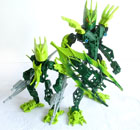
I was originally going to put this under Set Design, because it technically is all design stuff, but I had a lot of fun messing with little!Gresh and big!Gresh together. And hey, this is my review anyway. little!Gresh certainly has better proportions than the big. I was also intrigued how the original blended swords and mask would look on little!Gresh, so I tried them. And then had to see how big!Gresh would look with the new ones. I knew it wouldn�t be good, but good gods he looks awful with the solid lime mask and silver. But little!Gresh looks awesome with the big one�s swords, but not so much the mask � because his chest is lime, the dark mask doesn�t work so well. So: Much better. I actually think this combination looks really, really cool. But I�m still glad little!Gresh comes with silver swords. And people have also remarked on his new eye color of neon green, so I decided to test little!Gresh with his original orange eyes. I think the combination�s okay, but orange and lime are never the best of pairs, so let�s stick with the much neater neon green. Though, you know what I�d like to see? Black eyes under that mask. It would make the eyes stand out from the brightness of the mask without resorting to a clashing color. Plus it�d be cool. Anyway, moving along. The fact that his arms are pre-bent means that he�s constrained to poses like these, which look very cool but leave one wishing for a little more variety� as usual. His swords also get in the way sometimes. Their sheer size and angle causes them to bump against his shoulder armor almost constantly � in fact, I find that they look best when the tips of the blades rest in the niche between the bottom of the shoulder armor and his elbow. Unfortunately, if you put little!Gresh�s swords together into their shield, it�s a little big on him. About as tall as he is. Which would be good for defense, but since his arms are so short it just becomes problematic. And speaking of things problematic, the jawline of his mask tends to bump up against the flared top of the Avotoran body when he�s looking from side to side. He has to look up simultaneously to avoid it. Oh, and when posing little!Gresh with other sets, please promise me you�ll never ever do this: The comic All That Glitters just looked beyond ludicrous when there was this inexplicably midget-sized Gresh standing amid a bunch of normal-height Glatorian. About as ridiculous as our heroes defending themselves against a horde of tiny Rahkshi. Moral of the story: the Stars are cute, but they don�t mix well with full-scale sets. They just� don�t. Final Thoughts
In the end, I�m torn. I really, really like Gresh�s new set. It�s a great set from almost every angle, and I�m really happy with it. But, as with all the Stars, I just can�t help wishing he was a little something more creative to send out Bionicle with. These have been a truly great ten years, with their ups and downs, and they deserve to go out with a bang. Gresh just doesn�t quite do that. And yet� He�s so adorable and spunky that I can�t help but love the guy. The oversized swords and mask are just ridiculously cute, and he�s got everything I like in a set � recolored pieces, some great new molds, and on top of all that he�s actually faithful to his original form. So when it comes down to it, in and of himself he�s certainly a good set with which to bid farewell to Bionicle. And he�s a worthy purchase definitely � much more so than many of the other Stars, I might add. So� get him, and have fun with him, and enjoy this last green set Bionicle will ever see. I certainly have. 
|
